With Mac OS X 10.10 (Yosemite), Apple decided to change the green button in the window title bar to trigger fullscreen mode (in most applications):
The behavior of this button in all versions of Mac OS X up to 10.9 (Mavericks), was to “zoom” the window, that is, make it as large as the content displayed in the window.
The new behavior of this button in Yosemite is not very useful, for several reasons explained in my post Why the New Fullscreen Button in Mac OS X Yosemite Is Bad.
So if you feel that you want to have the old Mavericks behavior back, read on.
Restore the Yosemite Fullscreen Button to a Zoom Button
There is a way to kind of restore the green button behavior of Mavericks in Yosemite.
- Install the free BetterTouchTool (BTT) – http://www.boastr.de/
- In BTT, switch to “Advanced” view
- In the tab “Other”
- Select Application: “Global”
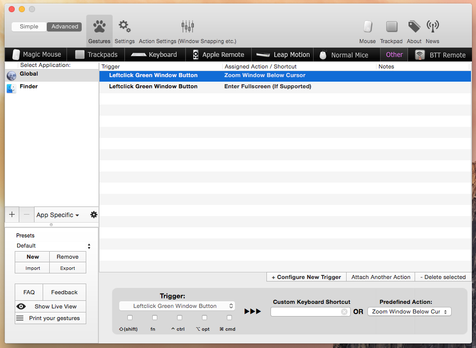
- Create a trigger: “Leftclick Green Window Button” with Predifined Action “Zoom Window Below Cursor”
- You are finished now. To still be able to enter fullscreen mode:
- Create a second trigger: “Leftclick Green Window Button” with key modifier “⌥ opt” and assign the Predefined Action “Enter Fullscreen (If Supported)”
BTT should now look like this:
Other Options of Zooming a Window in Yosemite
By default, Yosemite offers two options to zoom a window:
- double click the title bar (this only works if you uncheck the first checkbox in System Preferences -> Dock)
- Option (alt ⌥) + left click the green fullscreen button
But really, these are just workarounds – having to always press a modifier key to achieve something that used to work with a single click of the mouse is really not practical.
If you know any other way of restoring the zoom button behavior from Mavericks, let me know in the comments!
Please, Apple, Change It!
If you don’t like the new window controls in Yosemite, please leave Apple a feedback for Mac OS X and ask them to give us a setting (even a hidden one) to restore to the old behavior. Fullscreen could still be used by alt clicking the green button!


Please, apple, remove this obstacle, and send me an instruction to get out of this fix! Am 83 years old and had hoped the new system would improve use of this computer, not frustrate me.
David
I went to System Preferences. The control for what happens when you double click in the title bar of a window is in the “Dock” panel instead of the “General” panel, for some reason. I guess because the yellow dot dumps a window into the dock, so they put it there. Anyway, you have to turn off the option that tells the system to put a window into the dock when you double click on the title bar. When I did that, I found that double clicking on the title bar of a window was just as convenient as using the green dot. Perhaps more convenient, actually (hitting the broad side of the barn door, so to speak). It just means changing habits. For those of us who work with clients with varying versions of the Mac OS, it’s one more thing to remember that’s different, alas.
Thanks, I updated the page with the info regarding the necessary change in System Preferences.
Yes, double clicking the title bar can be convenient for some windows. The problem is that on many windows (e. g. Google Chrome, Firefox if you have many tabs open) the clickable area is really tiny and hard to miss (in sum its area is still larger than the green button, of course).