Change Mac OS X Yosemite Green Fullscreen Button

With Mac OS X 10.10 (Yosemite), Apple decided to change the green button in the window title bar to trigger fullscreen mode (in most applications):

The behavior of this button in all versions of Mac OS X up to 10.9 (Mavericks), was to “zoom” the window, that is, make it as large as the content displayed in the window.

The new behavior of this button in Yosemite is not very useful, for several reasons explained in my post Why the New Fullscreen Button in Mac OS X Yosemite Is Bad.

So if you feel that you want to have the old Mavericks behavior back, read on.

Continue reading “Change Mac OS X Yosemite Green Fullscreen Button”

Why the New Fullscreen Button in Mac OS X Yosemite Is Bad

In Mac OS X 10.10 (Yosemite), Apple changed the window interaction buttons. This change does not improve Mac OS X usability. This post explains why this is so.

Before Mac OS X 10.10 (Yosemite), Mac OS usually provided three buttons for window interactions:

Window controls in Mavericks

The green button was used to “zoom” the window, meaning that the window would enlarge to display all the window content. Because the application would decide how to handle the content, the zoom behaves a bit inconsistent: sometimes it would make the window as large as the whole screen (maximizing it), sometimes the window would only enlarge to fill a certain amount of the screen.

Mac OS X also displayed a fourth button to make the window fullscreen, for applications that supported this mode:

Fullscreen button in Mavericks

But in the latest version of Mac OS X, 10.10 Yosemite, the situation has become an unfortunate mess for the long term Mac OS user.

Continue reading “Why the New Fullscreen Button in Mac OS X Yosemite Is Bad”

Dvorak Keyboard Layout

This post describes how to set up the Dvorak keyboard layout on Windows, Mac OS, and Linux.

Update: Now also available as a portable version for Windows (admin permissions not required).

Basically, the standard qwerty/qwertz keyboard layout is bad. That’s why the Dvorak layout was developed. The only problem is that not all good things make it and become a standard.

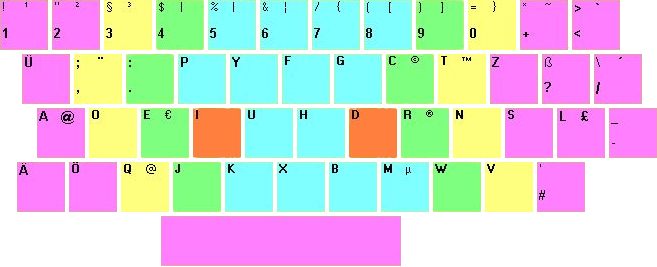
Let’s take a look at a typical German Dvorak layout:

dvorak
This is a mixture of Dvorak German type 1 and typo 2 layouts, with minor other changes.

Read on for instructions how to set it up on your Windows, Mac OS X, or Linux computer.

Continue reading “Dvorak Keyboard Layout”